Hang in there folks, we should be over this hump soon.
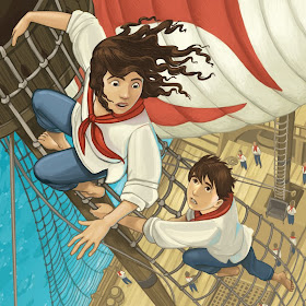
Anyway, I realize that for an illustrator's blog, I rarely post much of my actual illustration work. Here's a detail from a painting I did last week for a Scholastic Book Fair series I've been doing covers for. It's called The Secret in the Attic series. This one's based on Christopher Columbus.
This is all Photoshop. I'm getting better at making my digital paintings look like my paint paintings.

My title for this is, "Hey you kids! Get down from that mast!"
Next week I'm going to power right through to the end of the Taco Hell story. For real.

I love it, Nate! Your work is always wonderful. :)
ReplyDeleteWow! If I may ask, what version of Photoshop did you use?
ReplyDeleteThis is with the most recent version, CS5.1. I only just upgraded from CS a few months ago.
ReplyDeleteHere's my method of using photoshop: I don't use any filters or weird brushes. I basically use it like a set of markers. I will do it on maybe four layers, sketch-solid colors-details-highlights.
Every once in a while, I'll glance through one of those Photoshop Painting magazines (you know, the ones that are like, $30) and look at all the bad textures, lens flares, blurs and trick brushes, and think, "Maybe I should try these." But I never do.
Nope, I use it like a $1200 box of Prismacolors.
That looks amazing!
ReplyDeleteThat looks pretty good! Nice job! YOur Photoshop paintings look a lot like your paint paintings.
ReplyDelete